Building TUI Themes for VitePress
Terminal UI aesthetics have been having a moment. NeoVim distributions like LazyVim and AstroNvim have popularised the look: dark backgrounds, monospace fonts, nerd font icon glyphs, and status bars packed with information. This post walks through how I brought that aesthetic to a static site.
Design principles
A few rules I set for myself up front:
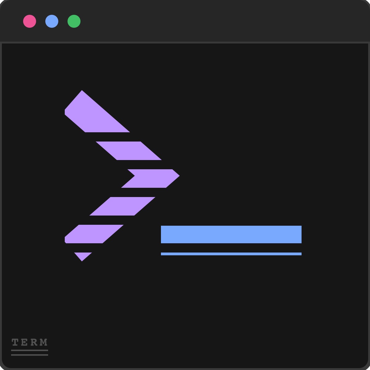
- No colored background blocks for decorative arrows — separators should be colored text glyphs, not filled powerline segments
- IBM Oxocarbon palette only — consistent Carbon Design System colors for both dark and light modes
- Everything monospace where it makes sense — UI chrome (header, sidebar, statusline) uses IBM Plex Mono; prose uses IBM Plex Sans
Layout
The layout is a fixed-height viewport split into three horizontal zones:
┌──────────────────────────────────────────┐
│  user@terminal:~/blog  ❯  blog  about    │  header (36px)
├────────┬──────────┬───────────────────────┤
│        │          │                       │
│  FILE  │  POSTS   │  content              │  body (flex)
│  TREE  │  (RSS)   │                       │
│        │          │                       │
├────────┴──────────┴───────────────────────┤
│  NORMAL  ❯  ~/blog/post  ❮  45%  ❮  12:34│  statusline (24px)
└──────────────────────────────────────────┘
The blog post panel only appears on blog post pages. The blog index is a full-width list view. All other pages show just the sidebar and content.
Color mode
VitePress has a built-in appearance system, but I disabled it (appearance: false) to implement a three-way toggle: auto → dark → light → repeat.
The selection is persisted in localStorage under terminal-color-mode. An inline <script> in the <head> applies the html.dark class before the first paint to prevent flash.
// In config.mts head
['script', {}, `(function(){
  try {
    var m = localStorage.getItem('terminal-color-mode') || 'auto'
    var d = window.matchMedia('(prefers-color-scheme: dark)').matches
    if (m === 'dark' || (m === 'auto' && d)) {
      document.documentElement.classList.add('dark')
    }
  } catch(e) {}
})()`]
Nerd Fonts
Icons come from the Nerd Fonts Symbols Only font, loaded via jsDelivr. A utility .nf CSS class applies the right font-family:
.nf {
  font-family: 'Symbols Nerd Font Mono', monospace;
  font-size: 1em;
  line-height: 1;
  display: inline-block;
}
Then in templates: <span class="nf"></span> renders a folder-open glyph.
Syntax highlighting
Shiki handles code blocks with a dual theme — github-light for light mode and github-dark for dark mode. VitePress wires this up through CSS variables (--shiki-light, --shiki-dark) which swap automatically when html.dark is toggled.
This theme is a work in progress. If you find issues or want to contribute, check the project repository.
测试文本
简体中文
岳阳楼记
范仲淹
庆历四年春,滕子京谪守巴陵郡。越明年,政通人和,百废具兴,乃重修岳阳楼,增其旧制,刻唐贤今人诗赋于其上;属予作文以记之。
予观夫巴陵胜状,在洞庭一湖。衔远山,吞长江,浩浩汤汤,横无际涯;朝晖夕阴,气象万千;此则岳阳楼之大观也,前人之述备矣。然则北通巫峡,南极潇湘,迁客骚人,多会于此,览物之情,得无异乎?
若夫霪雨霏霏,连月不开;阴风怒号,浊浪排空;日星隐曜,山岳潜形;商旅不行,樯倾楫摧;薄暮冥冥,虎啸猿啼。登斯楼也,则有去国怀乡,忧谗畏讥,满目萧然,感极而悲者矣。
至若春和景明,波澜不惊,上下天光,一碧万顷;沙鸥翔集,锦鳞游泳,岸芷汀兰,郁郁青青。而或长烟一空,皓月千里,浮光跃金,静影沉璧,渔歌互答,此乐何极。登斯楼也,则有心旷神怡,宠辱皆忘,把酒临风,其喜洋洋者矣。
嗟夫!予尝求古仁人之心,或异二者之为,何哉?不以物喜,不以己悲。居庙堂之高,则忧其民;处江湖之远,则忧其君。是进亦忧,退亦忧;然则何时而乐耶?其必曰:“先天下之忧而忧,后天下之乐而乐”欤!噫!微斯人,吾谁与归?
时六年九月十五日。
繁体中文
桃花源記
陶淵明
晉太元中,武陵人捕魚爲業。緣溪行,忘路之遠近。忽逢桃花林,夾岸數百步,中無雜樹,芳草鮮美,落英繽紛。漁人甚異之。復前行,欲窮其林。林盡水源,便得一山,山有小口,髣髴若有光。便捨船,從口入。初極狹,纔通人。復行數十步,豁然開朗。土地平曠,屋舍儼然。有良田美池桑竹之屬。阡陌交通,鷄犬相聞。其中往來種作,男女衣著,悉如外人。黃髮垂髫,並怡然自樂。見漁人,乃大驚,問所從來。具答之。便要還家,設酒殺鷄作食。村中聞有此人,咸來問訊。自云先世避秦時亂,率妻子邑人來此絶境,不復出焉,遂與外人間隔。問今是何世,乃不知有漢,無論魏晉。此人一一爲具言所聞,皆歎惋。餘人各復延至其家,皆出酒食。停數日,辭去。此中人語云:「不足爲外人道也。」既出,得其船,便扶向路,處處誌之。及郡下,詣太守,説如此。太守即遣人隨其往,尋向所誌,遂迷,不復得路。南陽劉子驥,高尚士也,聞之,欣然規往。未果,尋病終。後遂無問津者。
嬴氏亂天紀,賢者避其世。黃綺之商山,伊人亦云逝。
往迹浸復湮,來逕遂蕪廢。相命肆農耕,日入從所憩。
桑竹垂餘蔭,菽稷隨時藝。春蠶收長絲,秋熟靡王稅。
荒路曖交通,鷄犬互鳴吠。俎豆猶古法,衣裳無新製。
童孺縱行歌,斑白歡遊詣。草榮識節和,木衰知風厲。
雖無紀歷誌,四時自成歲。怡然有餘樂,于何勞智慧。
奇蹤隱五百,一朝敞神界。淳薄既異源,旋復還幽蔽。
借問游方士,焉測塵囂外。願言躡輕風,高舉尋吾契。